How do you paint your senior parking spot? For as long as I can remember, Ascension has participated in the coveted tradition of parking spot painting. After being assigned to a spot in the senior parking lot, students are prompted to paint their parking spot with whatever they would like. The most difficult part of this process, at least in my opinion, is deciding what exactly to paint. In this article, I want to share the thought processes behind some of this year’s senior parking spots. Hopefully, those of you who will be seniors next school year will have a place to start!
Some parking spots were based on aesthetics, art styles, and colors the students enjoyed.
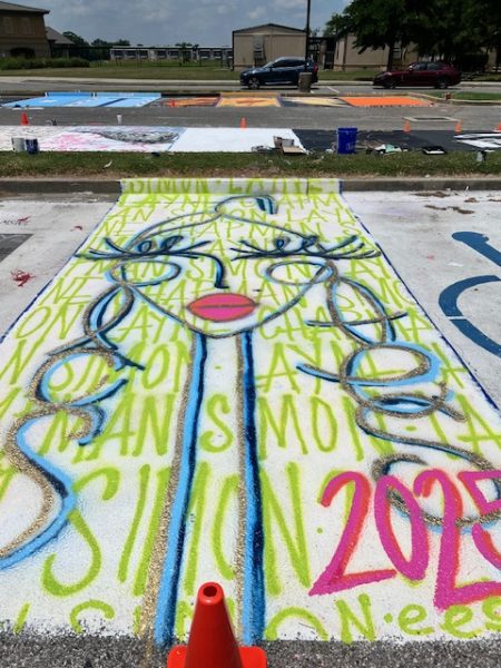
Layne Simon
Layne’s parking spot was designed with a girl’s face and her name repeated. She used a wide variety of colors, including greens, blues, and pinks. There are even shiny accents of gold.
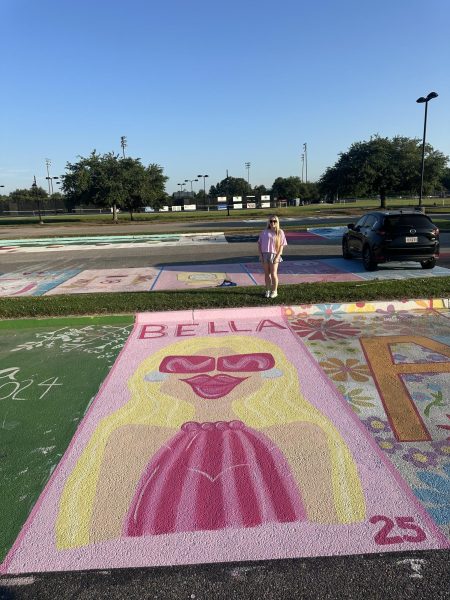
Bella Rougeau
Taking inspiration from “Gals in Glasses,” Bella painted a girl that resembles herself with her favorite color, pink. She used lots of paint, chalk, and a tent to keep cool in the summer heat.
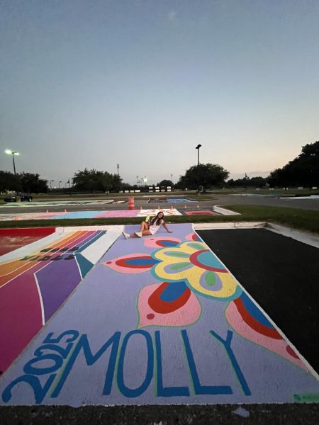
Molly Cormier
Molly chose to paint a colorful mandala-inspired flower with her name. She also included a scannable Spotify code in the bottom corner, so you should test it out if you get a chance! She used paint with a satin finish, and 8 colors total. Her process consisted of sketching with chalk, then filling in with paint. An interesting tip is that she used the Measure app to make sure everything was the correct size.
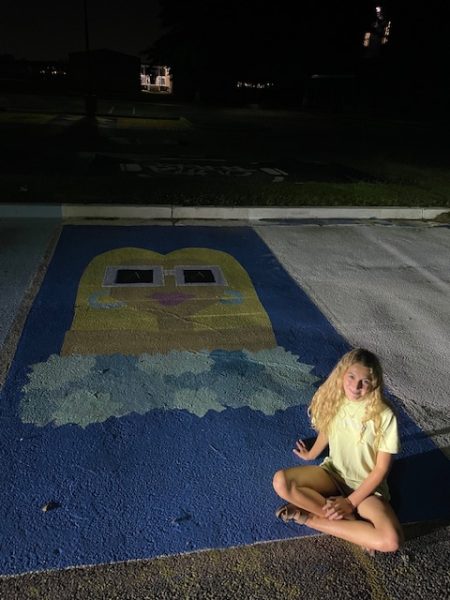
Estelle Anselmo
Estelle chose to paint a blonde girl with sunglasses inspired by “Gals in Glasses” in Ascension-themed colors. She liked the design, but wanted to connect it to our school for her senior year. She used a combination of exterior paint and spray paint, along with tape and pencils to make her design.
Claire Reddick
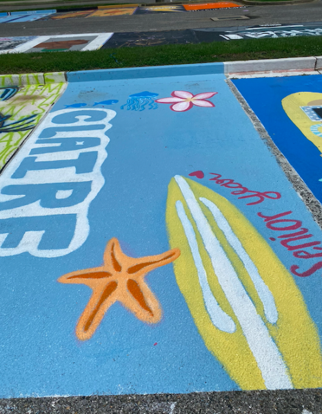
Claire designed her parking spot with a tropical themed design featuring a surfboard, flower, jellyfish, and starfish. She used bright, fun colors to match the theme, and also added her name!
Some students painted their parking spots based on important things in their lives.
Anna Hicks
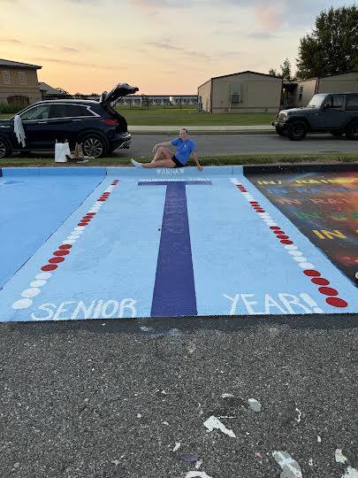
Anna decided to hone her interest in swimming by painting her parking spot to resemble a lane in a swimming pool. She used tape to make straight lines for the T-shape at the bottom of the pool and had to make perfect circles so everything was even.
Others were inspired by TV shows or movies they liked or felt represented by.
Sarah Camel
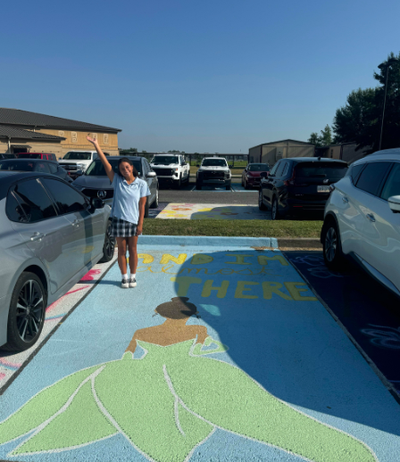
Sarah painted a quote from The Princess and the Frog, “And I’m almost there,” accompanied by a picture of Tiana because she is a big inspiration to Sarah. She used a pastel color palette with a light blue background.
Ethan Landes & Quinton Foshee
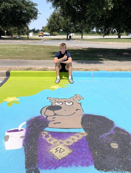
Ethan and Quinton painted Shaggy and Scooby Doo on their parking spots because it was a unique and clever design. Ethan said he shared many laughs with Quinton during this experience, and he said that accuracy was required for the design at times.
Annie Boudreaux
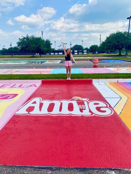
Annie painted the cover of the musical Annie because her name is Annie, and she watched the film often growing up. She started off with a primer, then a red background. She then sketched the name Annie and the character, and filled this in with paint.
Many students were inspired by music artists or album covers to create their spot.
Isabel Acevedo
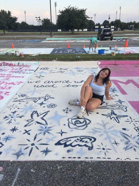
Isabel painted stars, angel wings, and other symbols inspired by an album cover in dark blue and silver on a cream-colored background along with a quote from Harry Styles: “We aren’t who we used to be.” She used a combination of exterior paint and spray paint to achieve her design.
Alexa Kidder
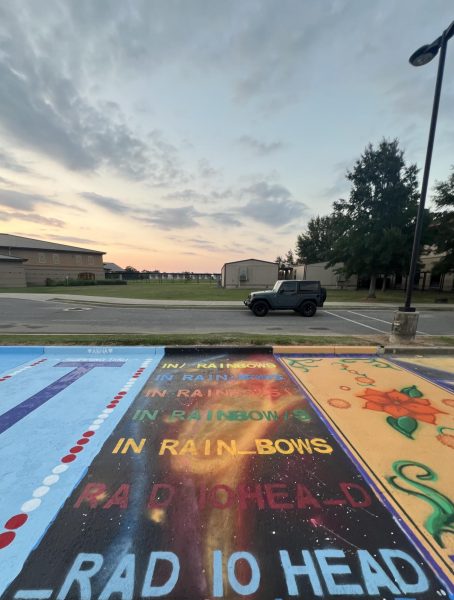
Alexa painted the album cover of In Rainbows by Radiohead on her parking spot, because she loves music and this is one of her favorite albums. To make the colors seamless, she mostly used spray paint and additionally handmade cardboard cutouts to paint the letters.
Ellie West
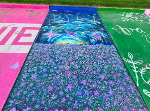
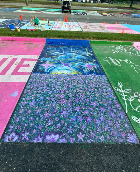
I combined images from some of my favorite music videos and the logo of one of my favorite music artists in matching colors, which were purple and light pink. I actually used a combination of exterior paint and acrylic paint to save money, and so that I could have a wide variety of colors. I was inspired by Molly, and used the Spotify code idea to incorporate a song that I felt matched my parking spot, too.

